Final UI Concept
Overview
Web Design 2, Spring 2023 - 8 Weeks
CLIENT:
Student Project for Web Design Course
PROCESS:
ROLE:
Researcher, Interviewer, Designer
MY DESIGN GOAL
Redesign the Santa Monica College website to give it a more modern and structured feel.
Problem, Insight, Solution
The problem that is being solved is how I can redesign the Santa Monica College website to provide a new look along with the current best functionality. I had to overcome the fact that the current SMC website provides every need currently thought of and had to use creativity to find a new way to display all the important information.
The insights I had during this design challenge was that combining a website that is so heavily relied on functionality with a completely new design takes a very fine line that doesn't disrupt the user experience and maintains ease of use for any student or faculty using the site.
The solution I had come up with is to go for a simplistic minimal feel on the new website, while maintaining all the important information someone might need on a daily basis. I decided to lessen the information displayed to prevent an overwhelming feeling for new students navigating the website.
Competitive Analysis
For the competitive analysis research, I looked into other universities such as UCLA, Cal Poly Pamona, CSU LB, & Loyola Marymount. After evaluating the various university websites, UCLA emerged as the top competitor due to its easy-to-navigate webpage. The website offers a clear and concise navigation menu, making it easy for users to find the information they need. The design is simple yet effective, with a consistent color scheme and layout throughout the site. While UCLA's website lacks an online chat feature for customer support, it offers easy access to contact information, including email addresses and phone numbers. The website also provides a comprehensive FAQ section, which covers various topics, such as admissions and financial aid, making it easier for users to find answers to common questions.
Heuristic Evaluation
During the heuristic evaluation, I gained a massive amount of insight into the details that will allow me to build the best possible redesign. The biggest takeaway from this evaluation was that there are so many navigational options and too much information to take in, especially for new students.
User Interviews
I conducted two user interviews with current users of the SMC website, which gave me many insights into the importance and pitfalls of the site structure.
Interview 1 Insights:
She cared most about having a nice-looking page, but easy-to-find information.
She was frustrated when a page didn't load and it was hard to navigate.
She remembers a time when she lost a class because the SMC website wouldn't load.
Interview 2 Insights:
He most cared about not having his time wasted digging through web pages.
He was frustrated by the fact that there were so many tabs and pages on the site.
He remembers a time when he used YouTube early on and saw how it developed into the best video site.
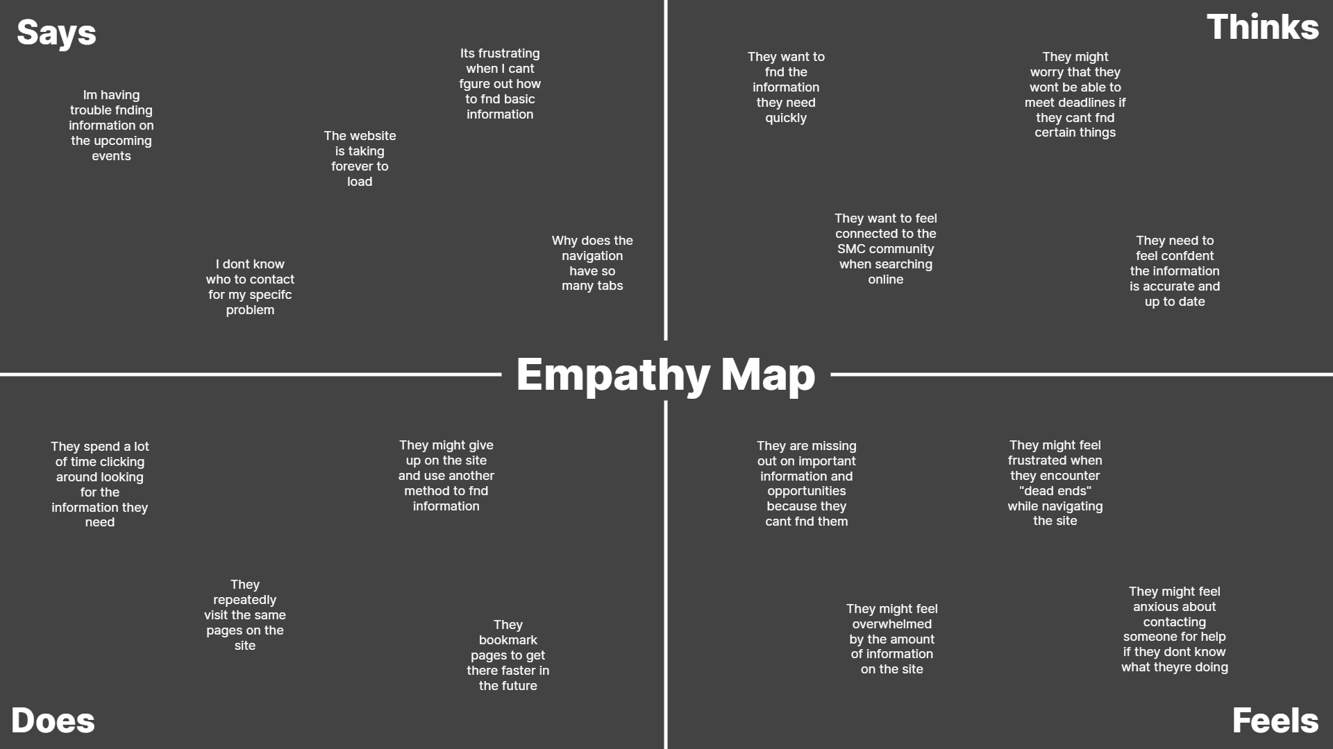
Empathy Map & Storyboard
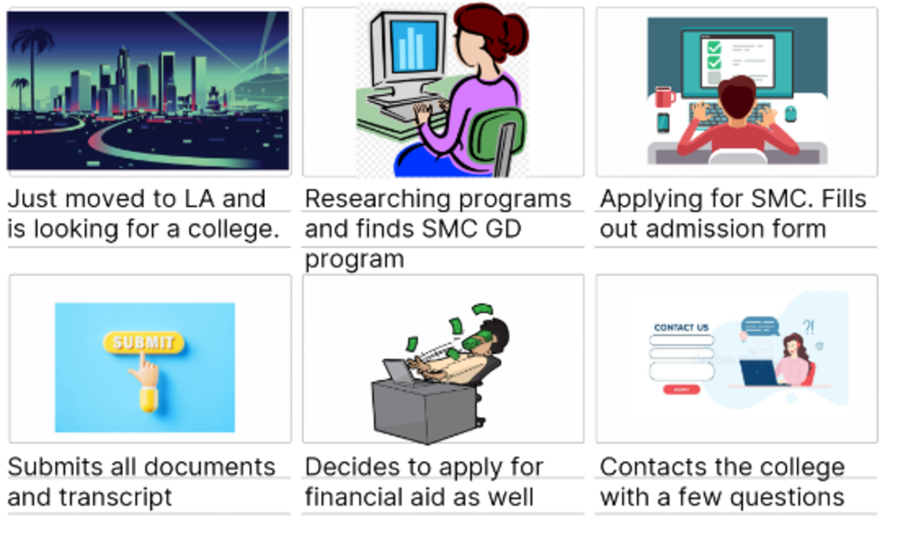
Creating an empathy map allowed me to understand how a site user thinks, feels, speaks, and what they do. This helped me create a storyboard as shown.
Ashley Johnson is a graphic designer who recently moved to Santa Monica and needed to find a local community college to further her education and skills. She visited the Santa Monica College website and navigated to the program section, searching for courses related to graphic design. Ashley reviewed the course details and requirements and then clicked on the "apply now" button to create an account and fill out the admission form. She submitted her application and received a notification to upload her transcripts and other supporting documents, which she completed. Ashley also explored the financial aid options available on the website and decided to apply for scholarships and grants to reduce her tuition fees. Lastly, she used the chatbot feature on the "Contact Us" page to get her queries resolved regarding the admission process.
Sitemap & Wireframe
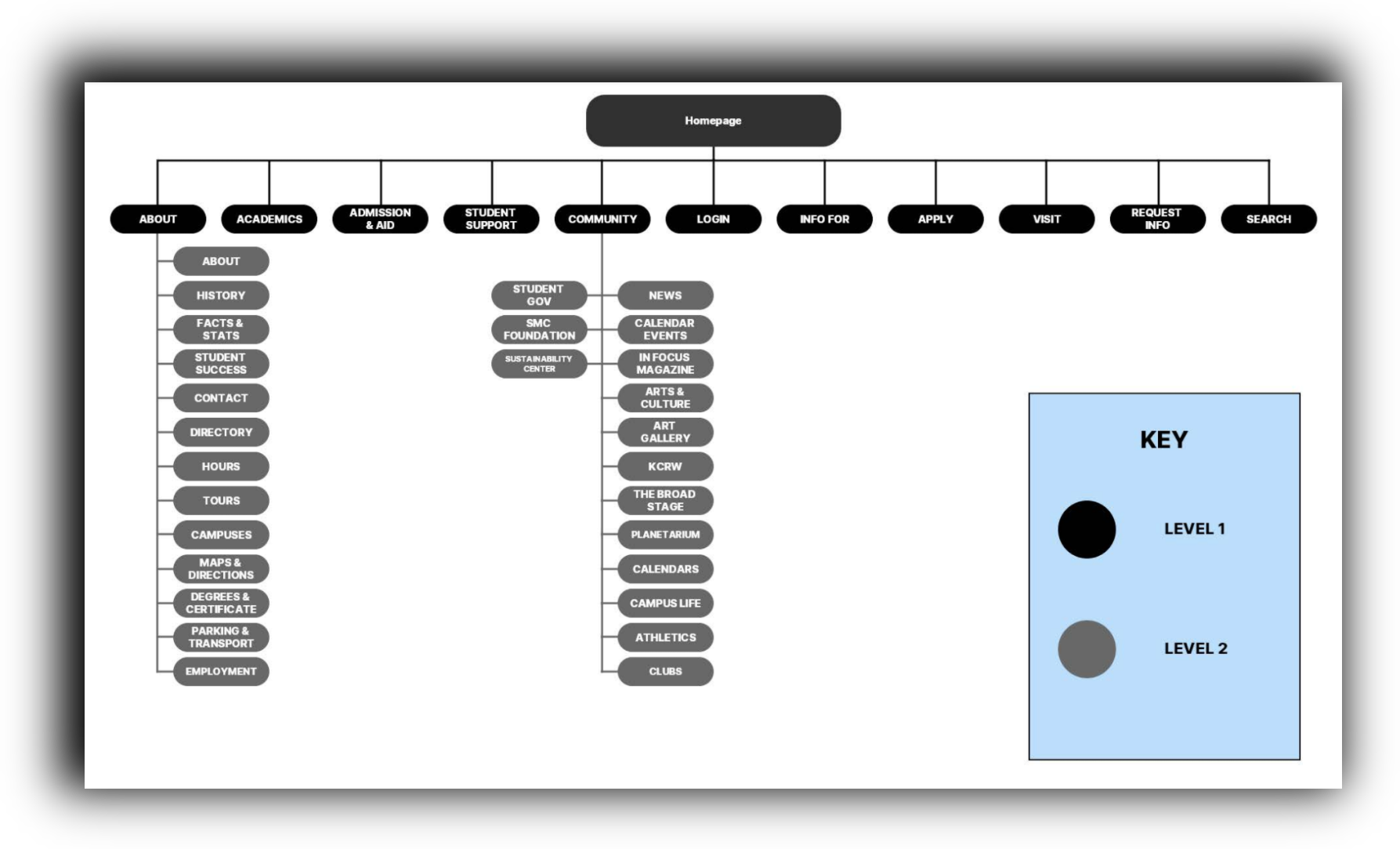
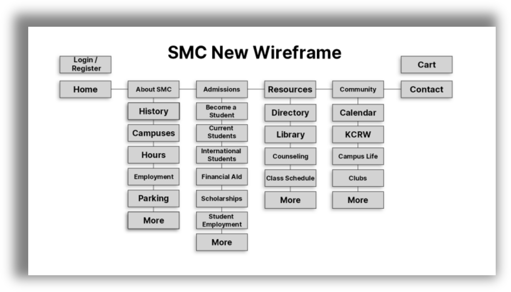
With an understanding of what needs have to be met in a redesign, I created a sitemap and wireframe to visualize the structure of my redesign. The new SMC wire flow aims to maintain the functionality, but reducing the amount of pages and navigation choices.
Initial Prototype
The wireframing ended with three initial prototypes that aim to organize clutter and provide information where needed.
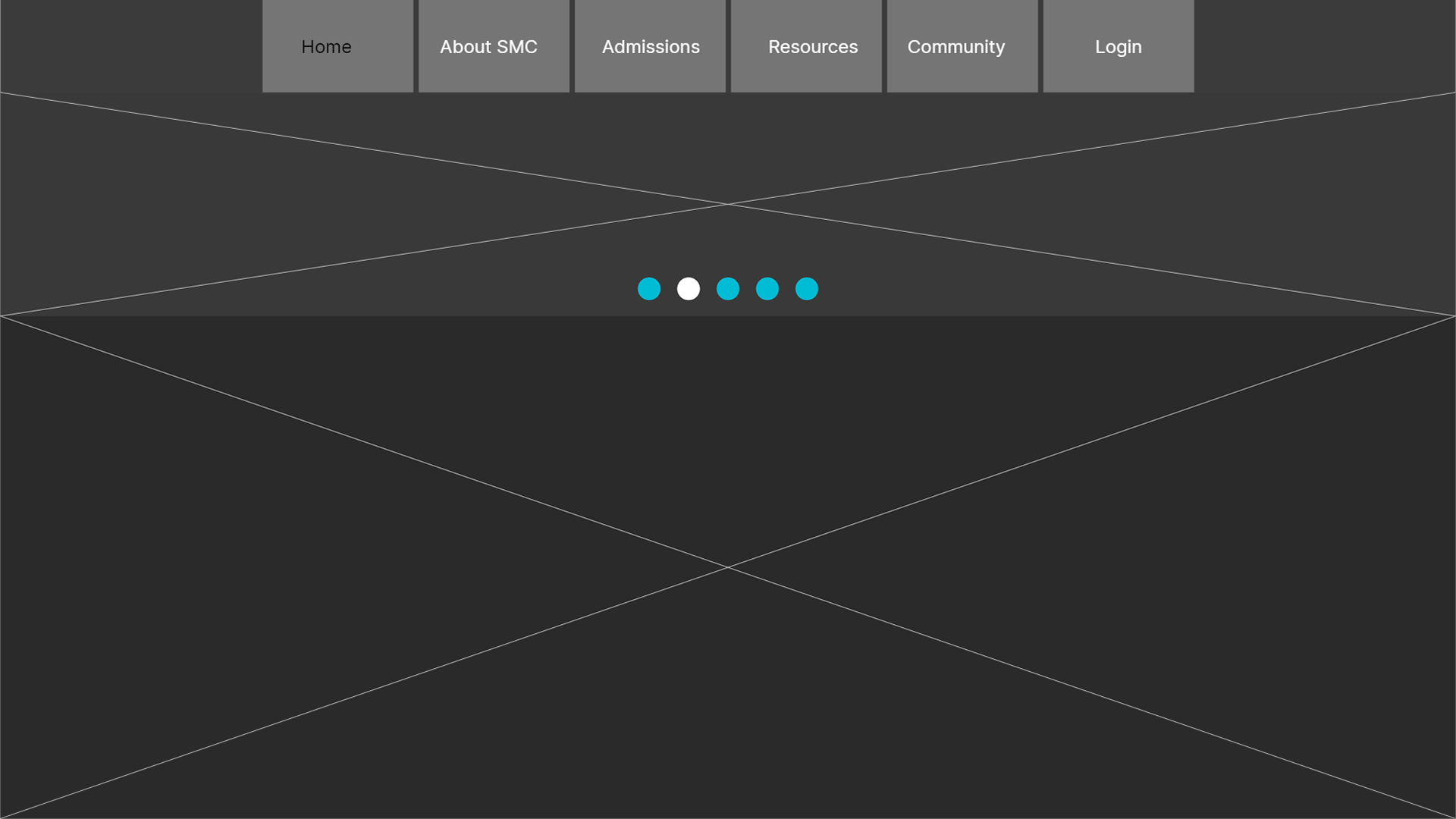
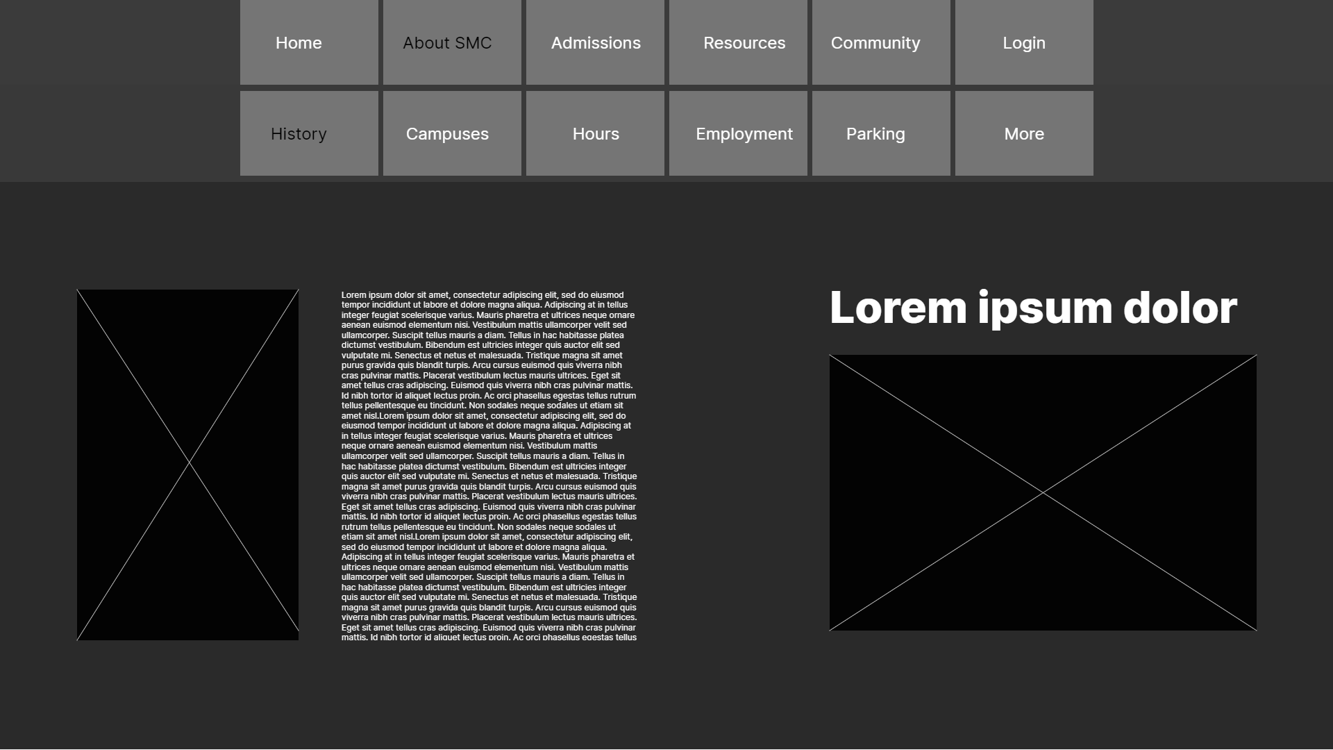
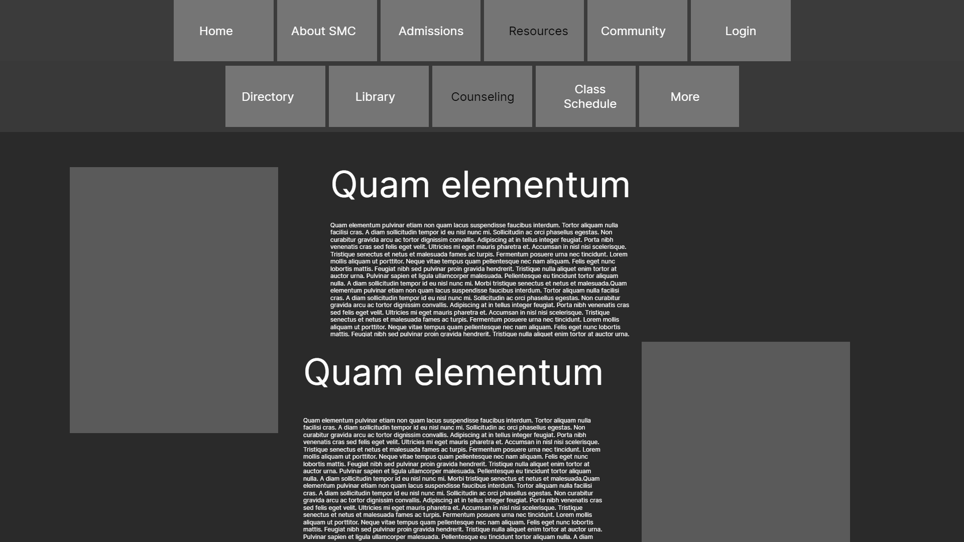
Sign-In Page
During usability testing, I discovered that the simplicity makes people a lot more comfortable with navigating the page. There could be some more information on how the buttons work.
Home Page
During usability testing, I learned that even with simplicity, there can't be oversimplified designs or it becomes the other extreme of uncomfortable. The design may seem too simple at times and not provide enough information.
Counseling Resources
During usability testing, I found out that words aren't the only things that matter, especially if they become paragraphs. Using buttons to provide information spread out could be an effective way of providing less information all at once.
History Page
During usability testing, I learned that it is okay to have large amounts of information when it comes to purely info-heavy sections. With this comes a dangerous line of too much information in one place. Ensuring the information is spread out is extremely important.
REFLECTION
After completing this assignment I learned to find the line between simplicity and functionality. I feel changing the level of information shown on a webpage worked well and I was able to pick out only the vital things to display on my site. I feel like this may have led to an oversimplification of these pages. If I were to do this again, I would definitely work more towards finding the best mix of both minimalism and functionality.